The title bar of the Report Editor window displays the name of the currently selected report.
The Report Editor window contains the following major parts:
- Toolbar
- Ruler
- Left margin
- Report Canvas
The Report Canvas occupies the majority of the window and is the workspace you use to add and position the components of the report. - Right-click menu
Using the toolbar
The toolbar icons have the following functions:
 Click this button to create a new report. You are prompted to verify that you want to delete the current report components.
 Click this button to add a data source.
 Click this button to add a row.
 Click this button to add a text cell.
 Click this button to add an image cell.
 Click this button to add a line cell.
 Click this button to preview the report on screen before printing.
 Select a report component, then click this button to view or edit its properties. Properties are characteristics of a report component, such as type and field for a text cell, sort and group options for a data source, and height for a row.
Tip
- You can also right-click on a component to view its properties.
 Select this button to run the Report Wizard. Before the wizard opens, you are prompted to verify that you want to delete the current report components.
Using the ruler
The ruler indicates the horizontal position of each report component. A blue, shaded area indicates the position and width of the selected cell. A red, vertical bar indicates your cursor's position on the Report Canvas.
Using the left margin
The left margin helps you identify each data source and row. To help you identify data sources, the left margin displays each data source's name and grouping, if any, in the upper-left corner of the data source area. To help you identify rows, the left margin displays each row's type in the upper-left corner of the row. The  symbol indicates rows that are part of a header area. The
  symbol indicates rows that are part of a footer area.
Using the Report Canvas
You use the Report Canvas to add report components, to specify where you want components to be positioned, and to select existing components and view or edit their properties. Properties are characteristics of a report component, such as type and field for a text cell, sort and group options for a data source, and height for a row.
- To select a component, click on it; a blue border surrounds the selected component. To increase the scope of the selected area, press Esc. For example, if a text cell within a row is selected, press Esc to select the entire row. If the row is contained within a data source, press Esc again to select the data source that contains the row.
- To view or edit the properties of a report component, double-click the component.
The Report Canvas contains several standard areas, which appear in any new report:
Page Header Area: This area contains report components that appear at the top of each page of the compiled report. You can add rows and variable or custom text cells to the Page Header Area.
The Page Header Area is different than the standard header you specify in the Page Setup dialog box. If you specify a standard header, the standard header is displayed at the top of the page in the compiled report, followed by the report's Page Header.
Report Header Area: This area contains report components that appear before the compiled report's details and on the first page of the report only. You can add rows and cells to the Report Header Area.
Data Source Header Area: Report components that appear before the data source's records in the compiled report. You can add rows and cells to the Data Source Header Area.
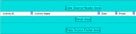
Detail Area: This area contains the bulk of the project data that are being reported and is the only area of the report to which you can add a data source. The data source indicates which category of database information the report compiles, for example, activity resource assignments or cost accounts. After selecting a data source, you add rows, and then cells within the rows, to the Detail Area. The cells specify the individual data fields you want to report for the data source you have selected. For example, in the following graphic, the data source is Activities. The row between the Data Source Header and Detail areas contains four field data text cells: Activity ID, Activity Name, Start, and Finish. In this example, the report will list the activity ID, activity name, start date, and finish date for all activities in the open project.
For each data source you add to a report, a Data Source Header, Detail Area, and Data Source Footer are added to the Report Canvas. The Data Source Header and Data Source Footer are required as upper and lower borders for the Detail Area.
Data Source Footer Area: Report components that appear after the data source's details in the compiled report. You can add rows and cells to the Data Source Footer Area.
Report Footer Area: Report components that appear after the compiled report's details and on the last page of the report only. You can add rows and cells to the Report Footer Area.
Page Footer Area: Report components that appear at the bottom of each page of the compiled report. You can add rows and cells to the Page Footer Area.
The Page Footer Area is different than the standard footer you specify in the Page Setup dialog box. If you specify a standard footer, the standard footer is displayed in the compiled report at the bottom of the page, after the report's Page Footer.
The Report Canvas provides visual cues to identify some report component properties.
- Data sources are color-coded. If a data source is embedded, or nested, in a parent data source, each data source displays in a different color. See Parent Data Source.
- Text cells are coded in the upper-right corner to indicate the type of data they report.
 - indicates a Custom Text cell, a cell that contains text you specify.
 - indicates a Field Data cell, a cell that compiles and reports information from a database field you specify.
 - indicates a Field Title cell, a cell that contains the name of a database field you specify.
 - indicates a Variable cell, a cell that reports information related to the overall report, rather than a specific data source, for example, date or page number.
 - Text cells displayed in red indicate that the cell's properties either have not been defined or that they conflict with the properties of the data source that contains the cell.
Note
- The Report Canvas does not display the actual height, or amount of vertical space, each report component will occupy in the compiled report. To view the report's vertical spacing, preview the report.
Report Editor tasks
- Add a background image to a report
- Add a border to a text cell
- Add a custom text cell to a report
- Add a data source to a report
- Add a field data or field title cell to a report
- Add a line cell to a report
- Add a report title
- Add a row to a report
- Add a variable cell to a report
- Add an embedded data source to a report
- Add an image cell to a report
- Add comments to reports
- Add HTML links to a text cell
- Add HTML links to an image cell
- Change report margins
- Change text cell color
- Change the sort order of report records
- Copy a data source
- Copy a row
- Copy and paste cells
- Cut and paste a data source
- Cut and paste a row
- Cut and paste cells
- Define a report header and footer
- Define default text styles for reports
- Define HTML print settings for an image cell
- Define layout options for a data source
- Define page setup options for a report
- Delete a data source filter
- Delete a data source from a report
- Delete a data source that contains embedded data sources
- Delete a line cell from a report
- Delete a row filter
- Delete a row from a report
- Delete a text cell filter
- Delete an image cell from a report
- Disable HTML links in a text cell
- Disable HTML links in image cells
- Filter a data source
- Filter a report row
- Filter a text cell
- Format text in a text cell
- Indicate hierarchy levels in reports
- Remove a background image from a report
- Remove borders from a text cell
- Show time distributions in a report
- Sort report records
- Specify a timeperiod for a report
- Specify image cell width and position in a row
- Specify line cell width and position in a row
- Specify text cell width and alignment in a row
Related Topics
Legal Notices
Copyright © 1999, 2016,
Oracle and/or its affiliates. All rights reserved.
Last Published Wednesday, May 25, 2016